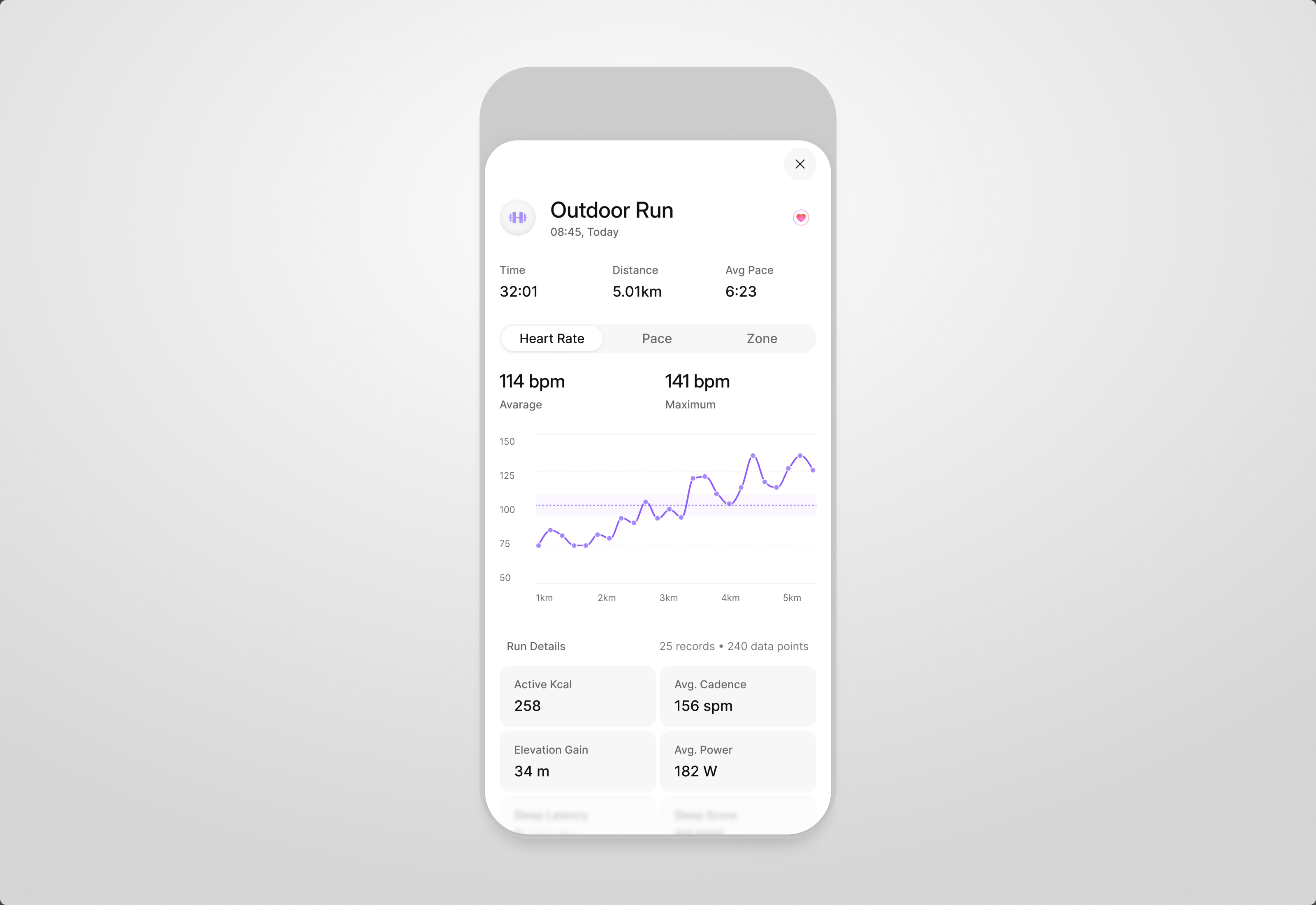
Defining what Phi should become and designing the foundations to get it there.
Phi was early when I joined: a small team working out what an AI health product should do for people. I moved between talking to users, deciding what to build next and designing the core experiences. 2025–2026
- Role
- Senior Product Designer at Phi Health. Research, product design and the design system, with the founders.
- Goals
- Launch Phi for free by Christmas, core features on time.
"She has an exceptional eye for detail and a strong ability to turn design thinking into systems that are clear and practical for engineers to implement."
Tina Roh
Worked with me on the Phi mobile app · now at Signal
We used research to decide what was worth building first.
We interviewed potential users about how they used AI, health and fitness apps, then grouped recurring needs, behaviors and frustrations into product opportunities. To define the scope, we prioritized what mattered most to users against what our small team could realistically build.
priority = user importance × recurrence implementation effort
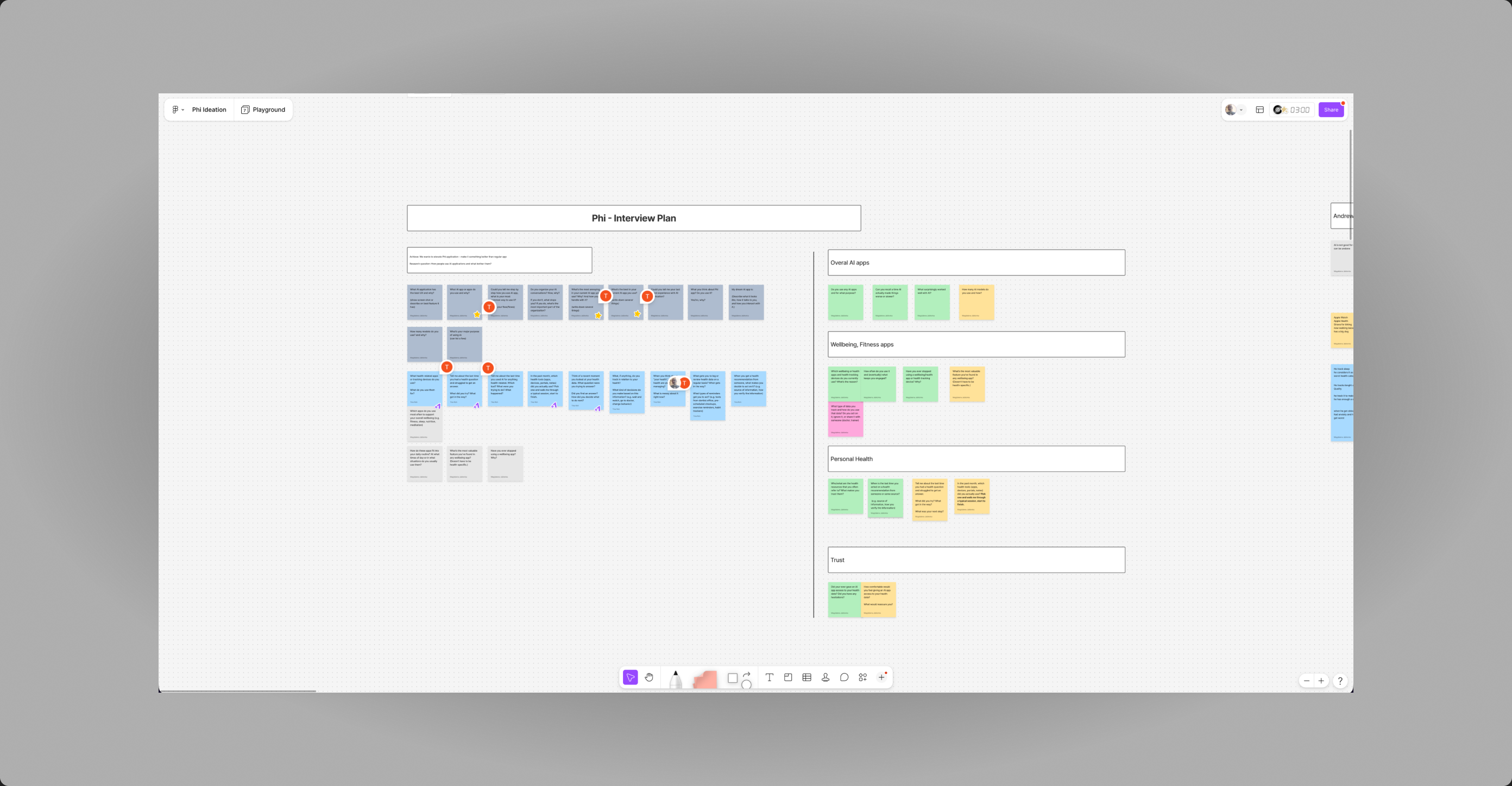
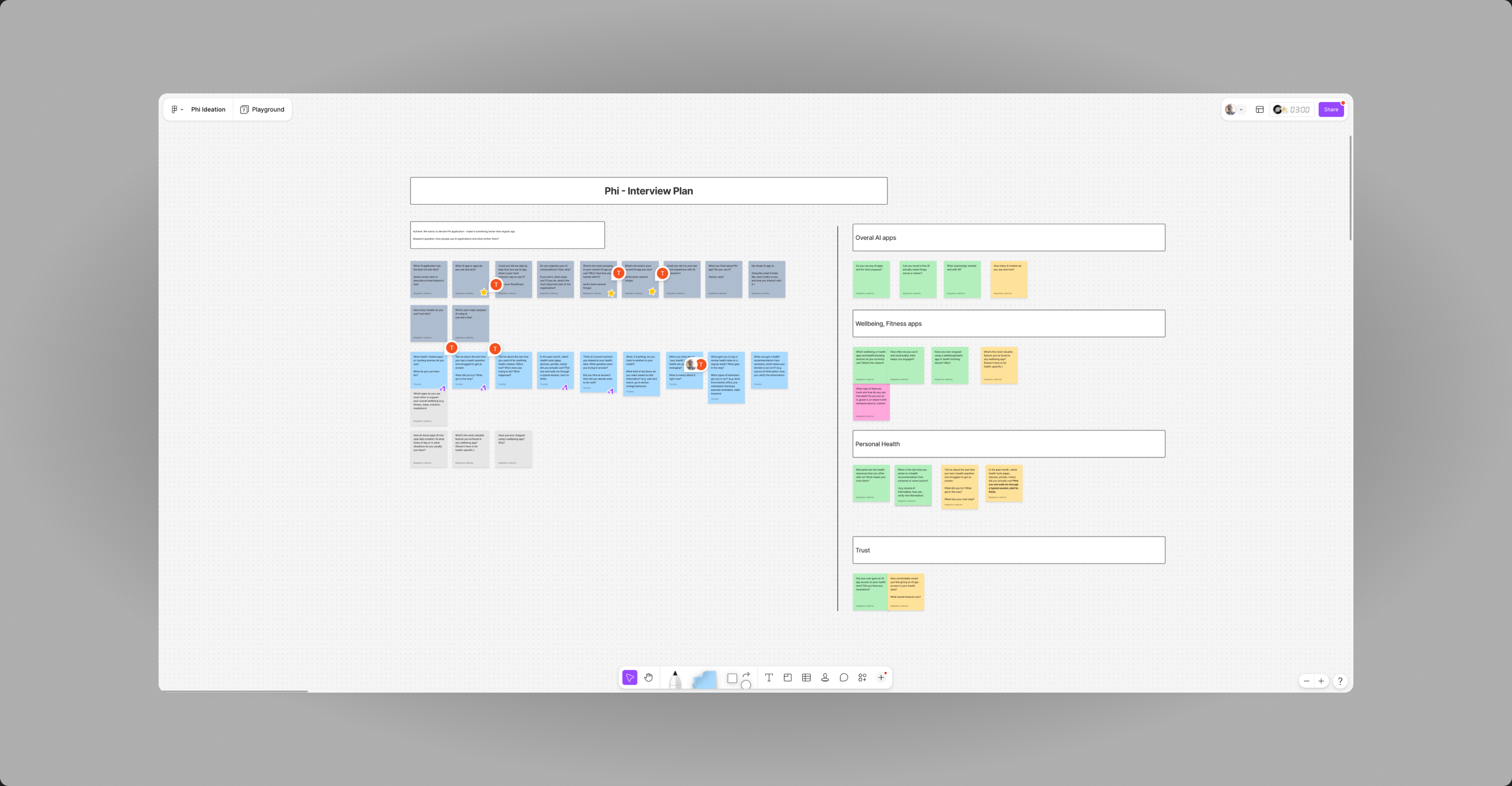
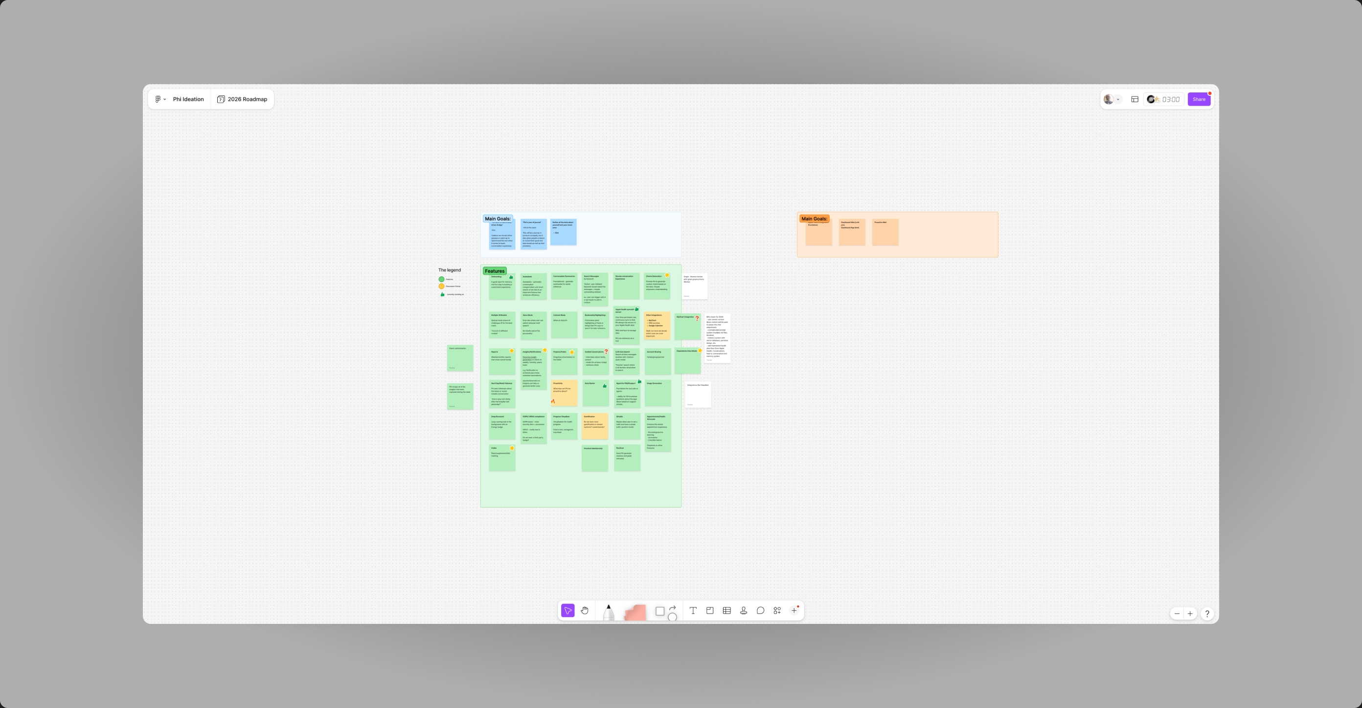
We started with a plan in FigJam: who to talk to, what we needed to learn, and the questions grouped by theme, from how people use AI apps today to what they expect from a health companion.
Every observation went on the board, then into clusters. Recurring needs, behaviors and frustrations became the list of opportunities we could actually prioritize.
The clusters turned into a 2026 roadmap: main goals, the features behind them, and a legend for what was decided, what was still a discussion and what we were already building.
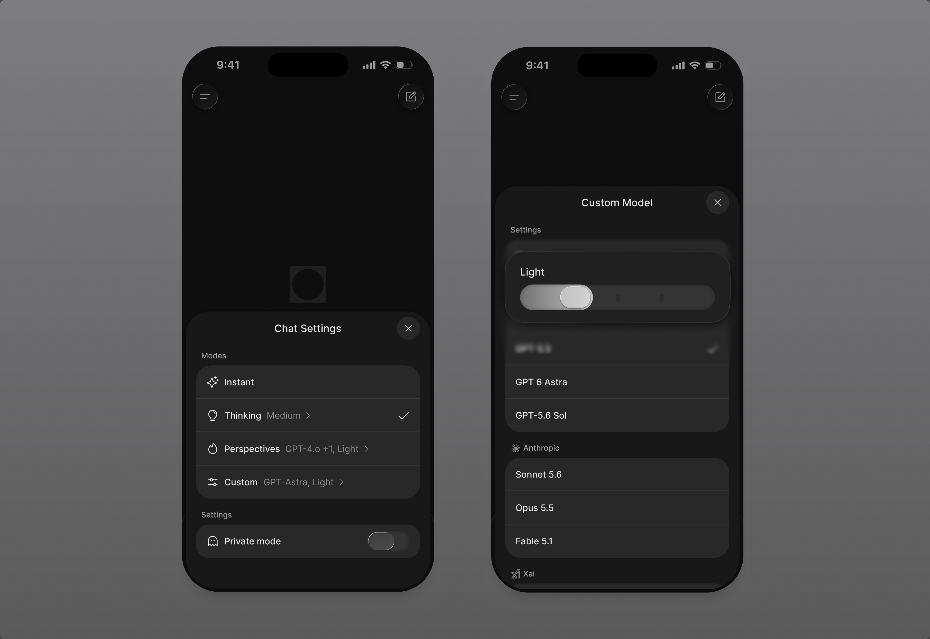
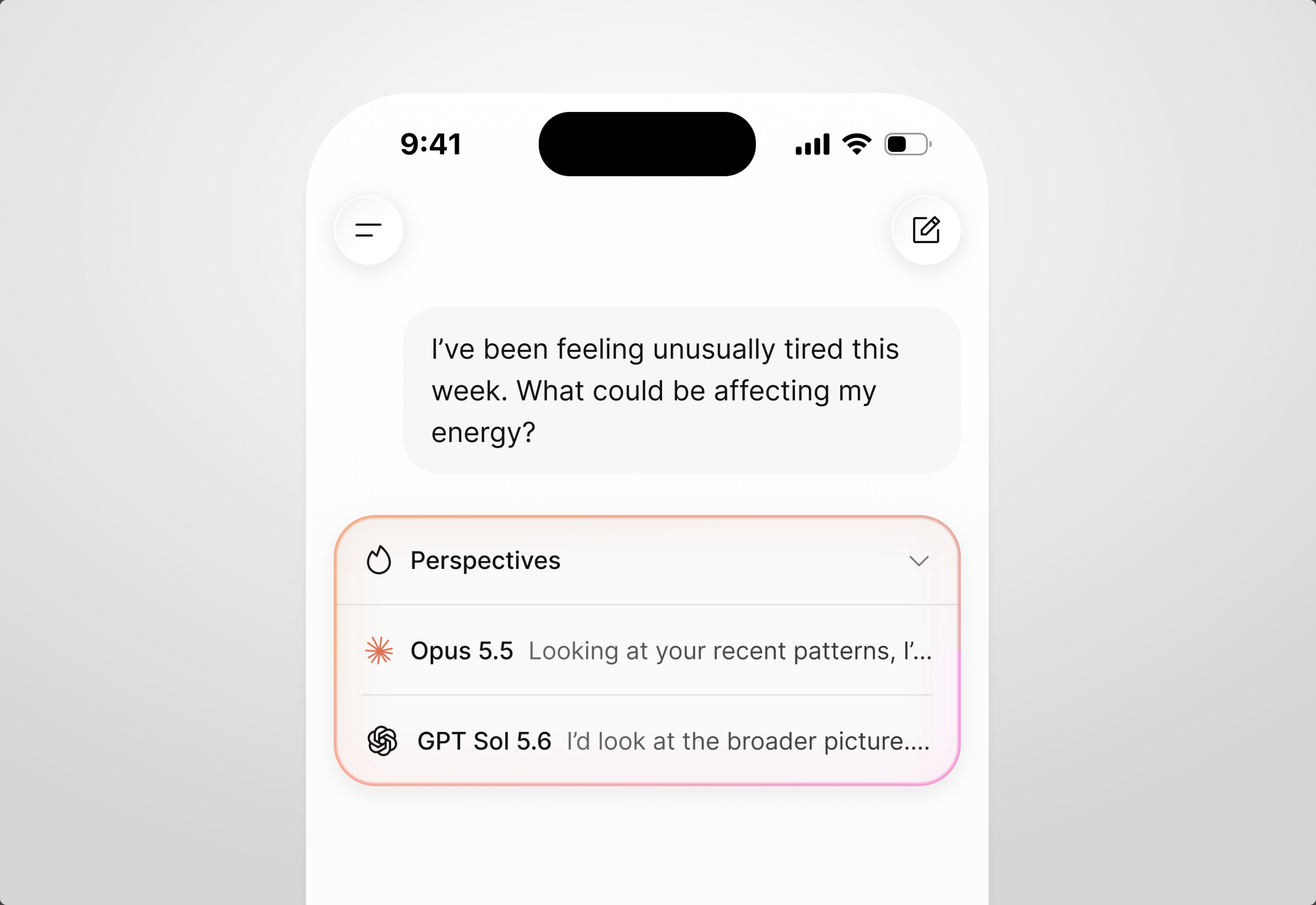
Doctors disagree. So do GPT, Claude and Grok. Phi asks them all and gives you one summary.
Unlike an assistant tied to one provider, Phi lets users choose which models to ask, compare their perspectives, and swap them as the question changes.
summary = model A + model B + model C Phi reasoning
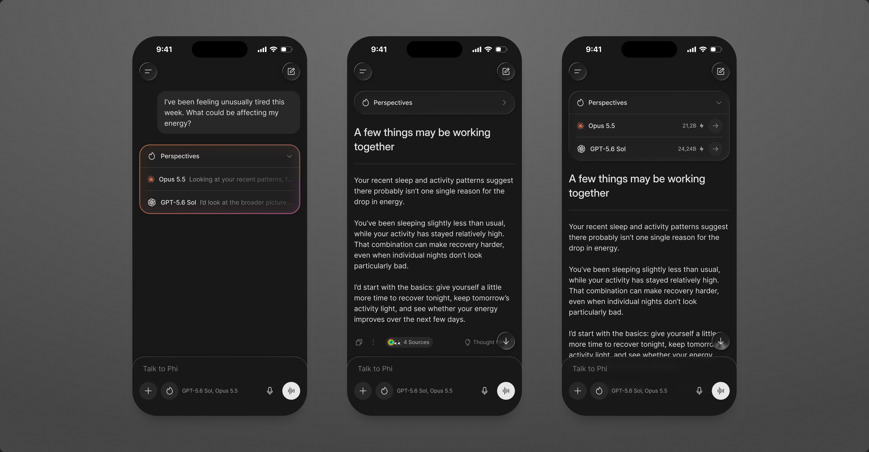
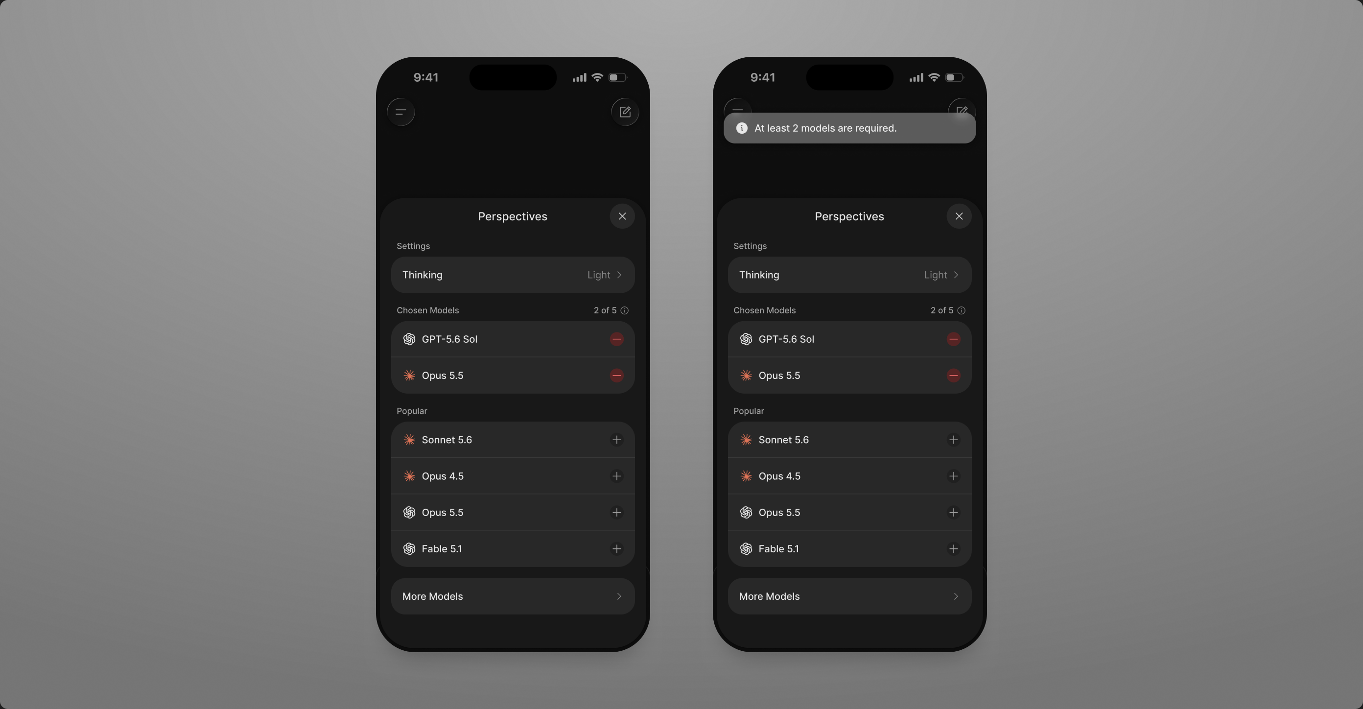
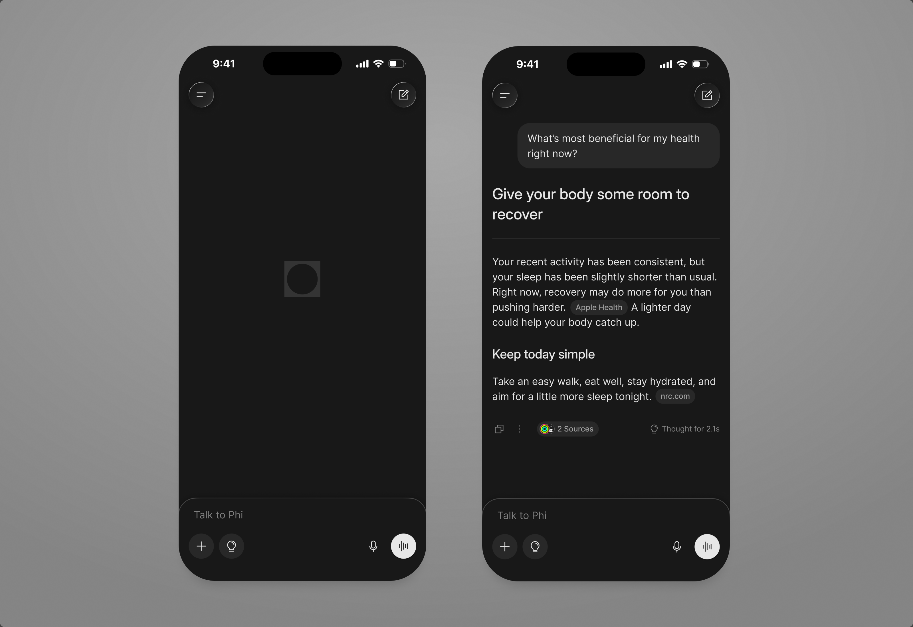
The harder question was what to show first. Showing every model response would be transparent, but it would leave users comparing answers themselves. We worked backwards from that step: Phi leads with one synthesized answer and keeps every response available underneath.
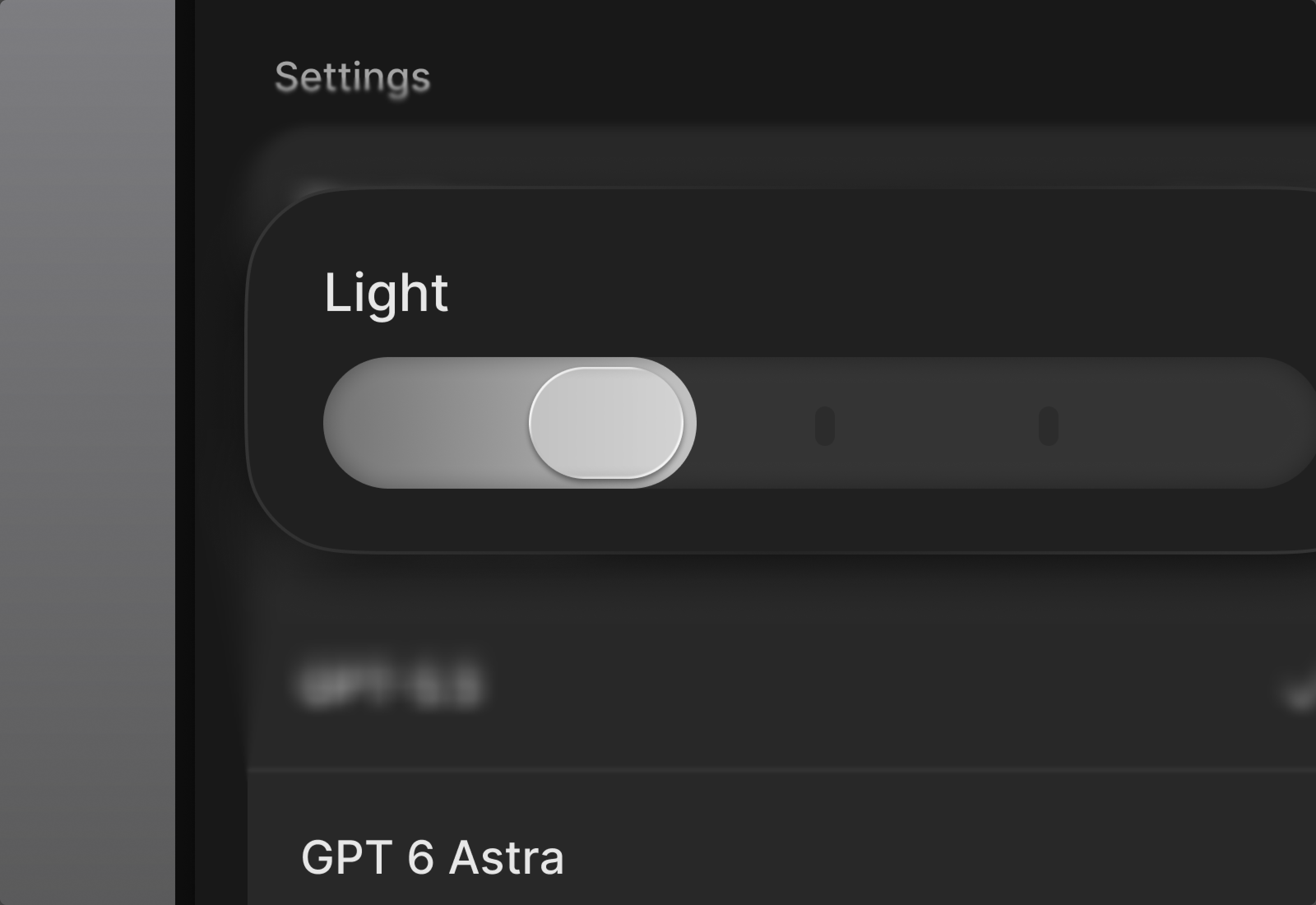
Users choose which models answer, at least two at a time, and how deeply they think. The settings sit one tap away from the answer, not in a separate screen.
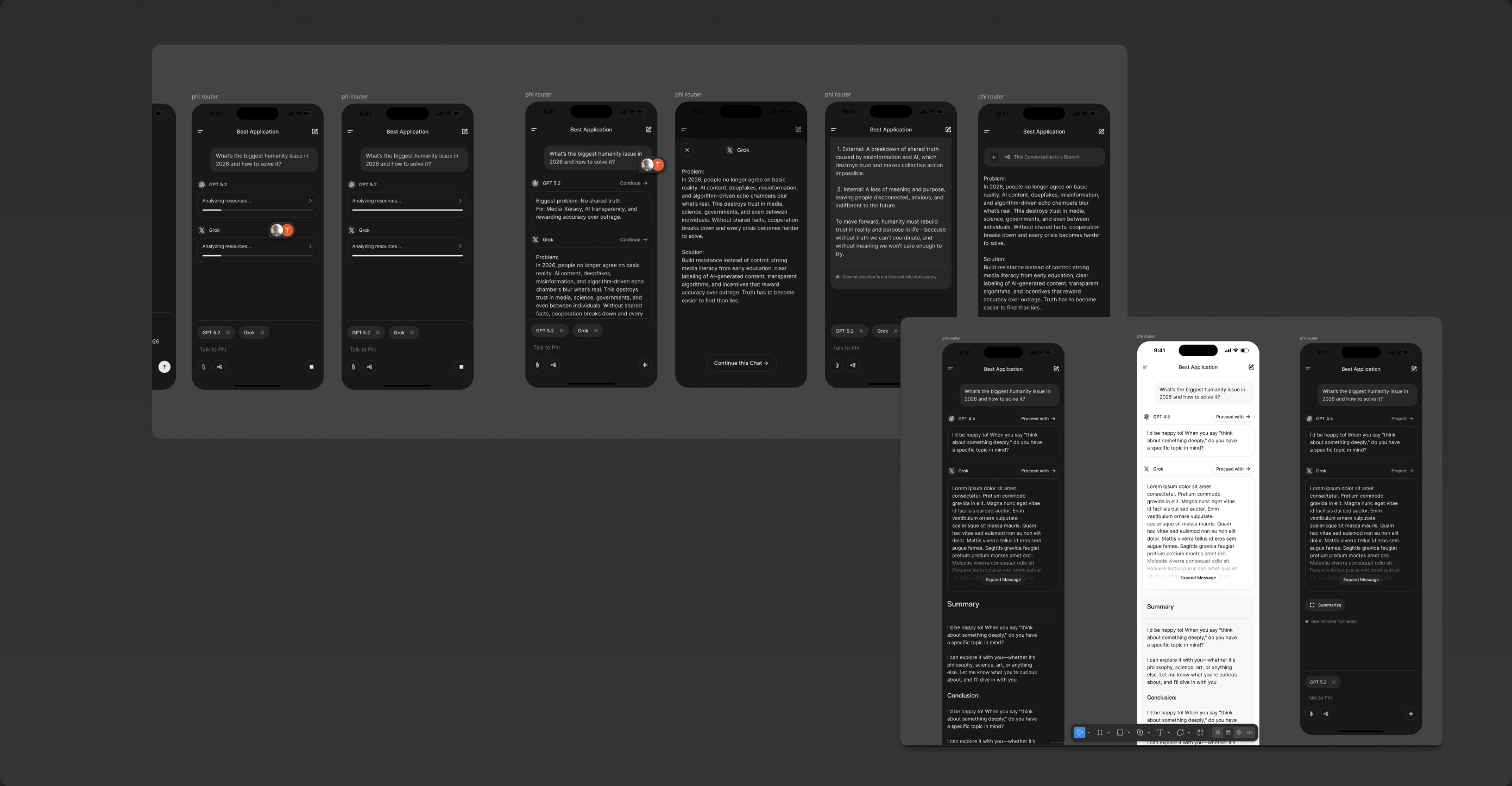
An earlier idea, phi router, put two models side by side in one thread and asked the user to continue with one of them. Clear, but it handed the comparing back to the user.
Phi sells physical supplement Stacks. We wanted to connect them with the digital health experience.
I explored a more product-led concept that lets users log an entire Stack to Apple Health at once. Phi adjusts it to the day and time, while keeping doses and timing editable when something changes.
physical Stack → Phi → Apple Health
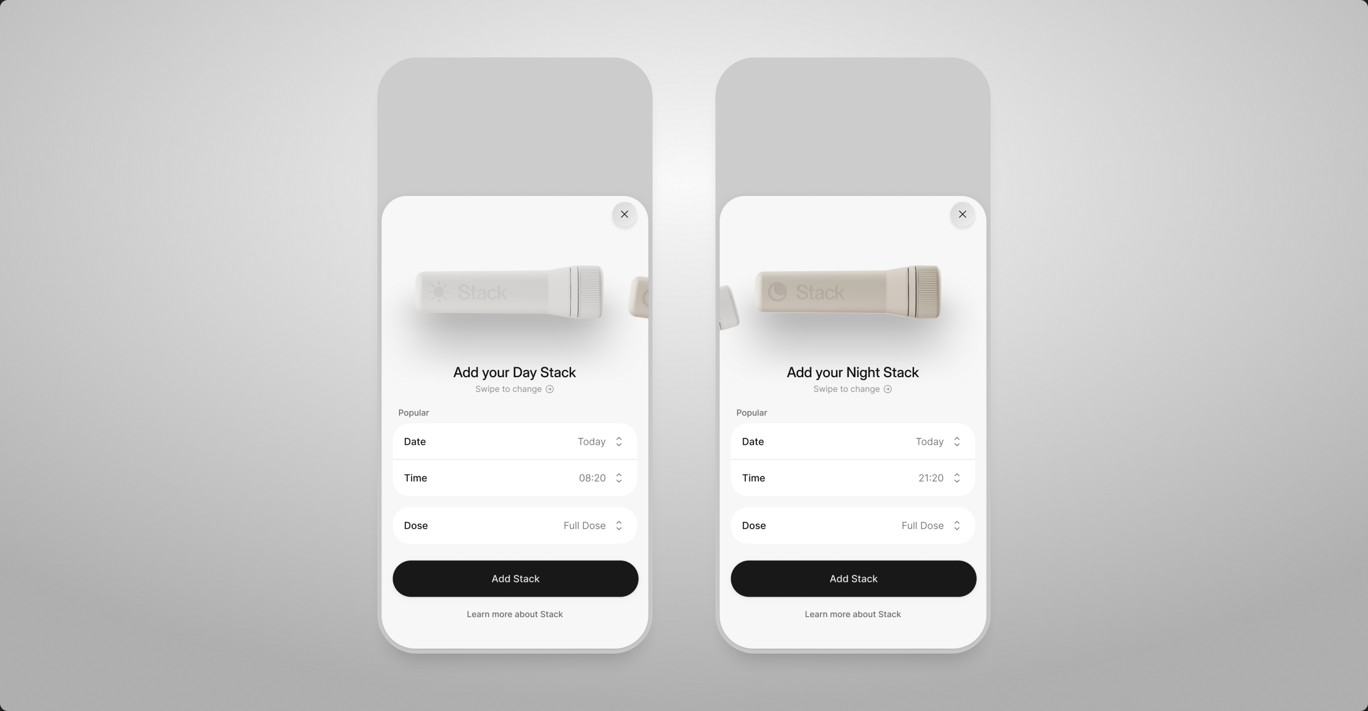
The goal was simple: Phi handles what it already knows, users only correct what’s different. Date, time and dose come pre-filled for the Day or Night Stack, one button logs it to Apple Health.
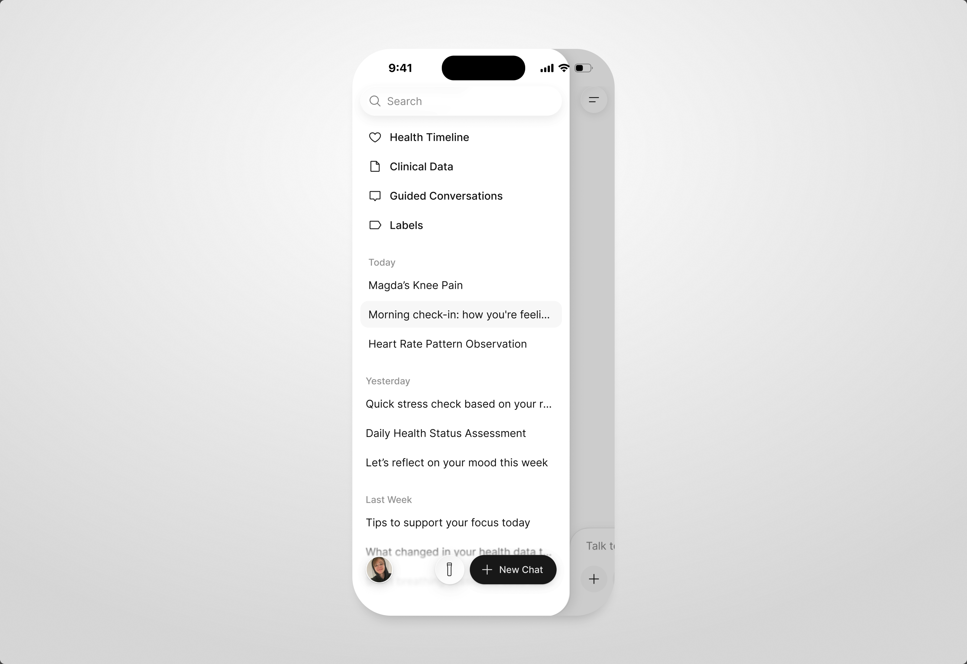
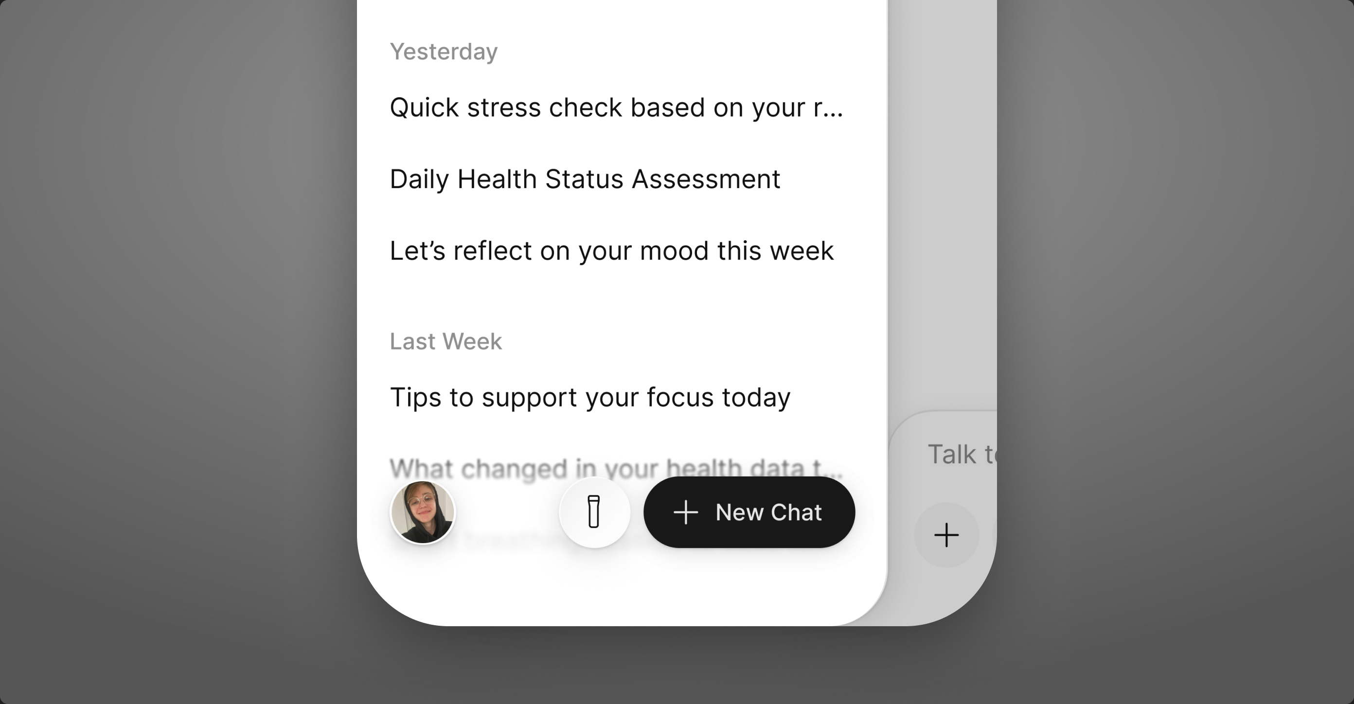
The Stack button lives next to New Chat, so logging a dose is as quick as starting a conversation.
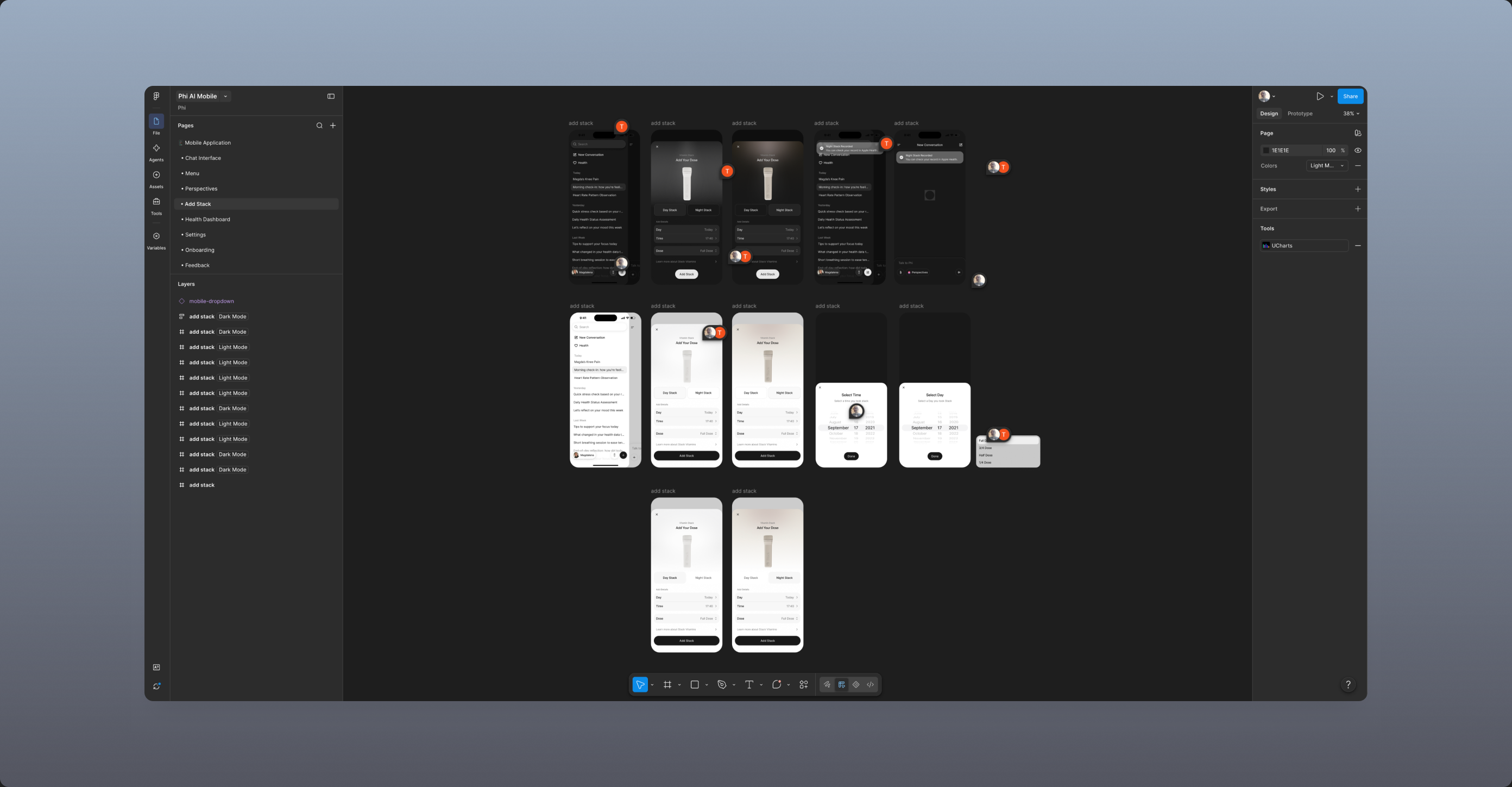
The first redesign, in Figma: light and dark variants, pickers and the anatomy of the sheet, before the flow settled.
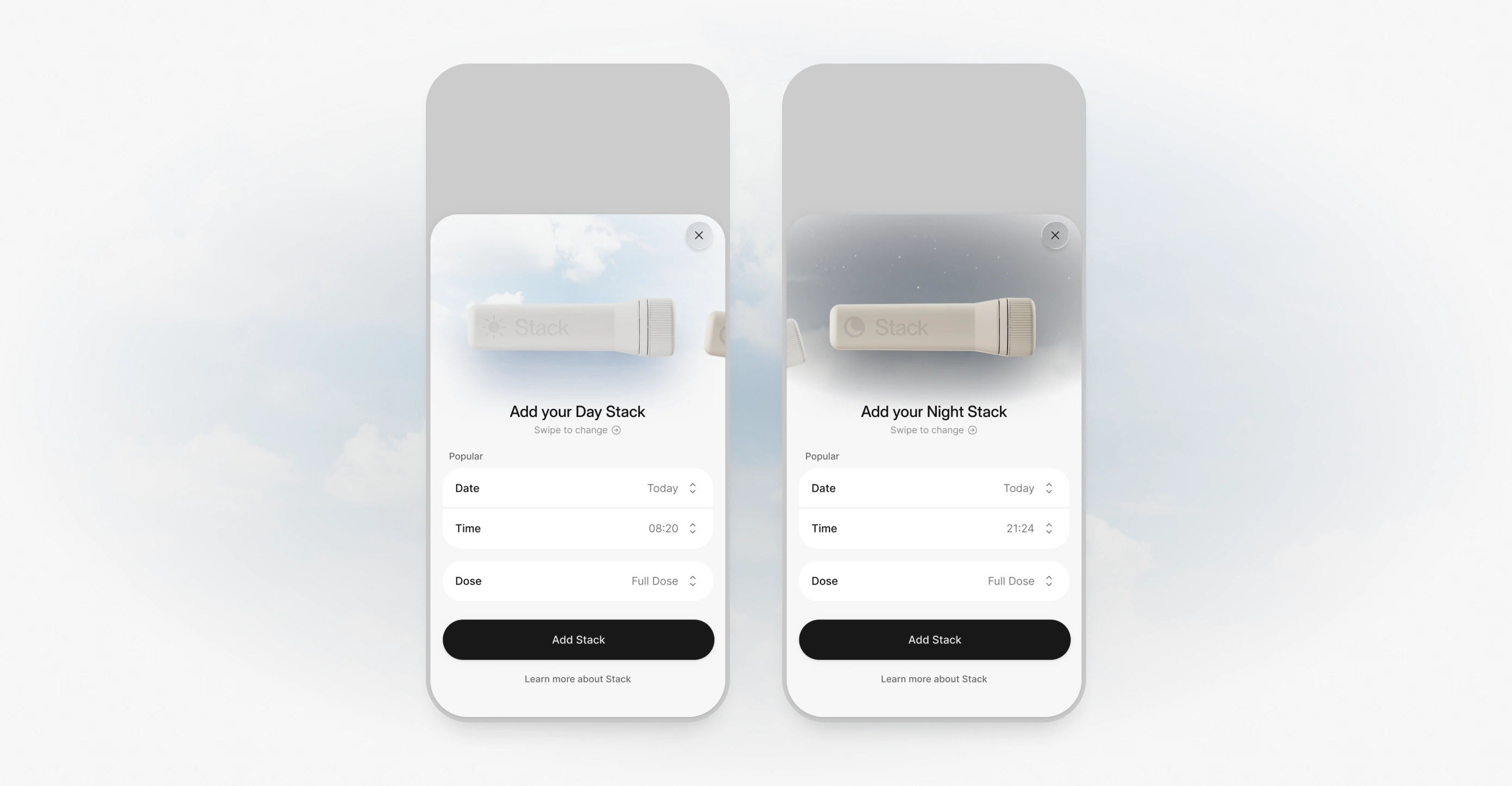
A direction with the product photographed against the sky. Calmer, but it pulled attention away from the one thing the sheet has to do.
Users needed to see what Phi knows about them. We couldn’t show the AI thinking, so we showed the data.
Trust in a health app starts with knowing which data the AI reads and reasons from. We had three constraints working against that. Showing the analytical layer inside the UI was off the table, because every extra inference clashed with our energy and token policy. We had little frontend and backend capacity to spare. And time was short.
no visible AI reasoning + small team + little time → Health Timeline
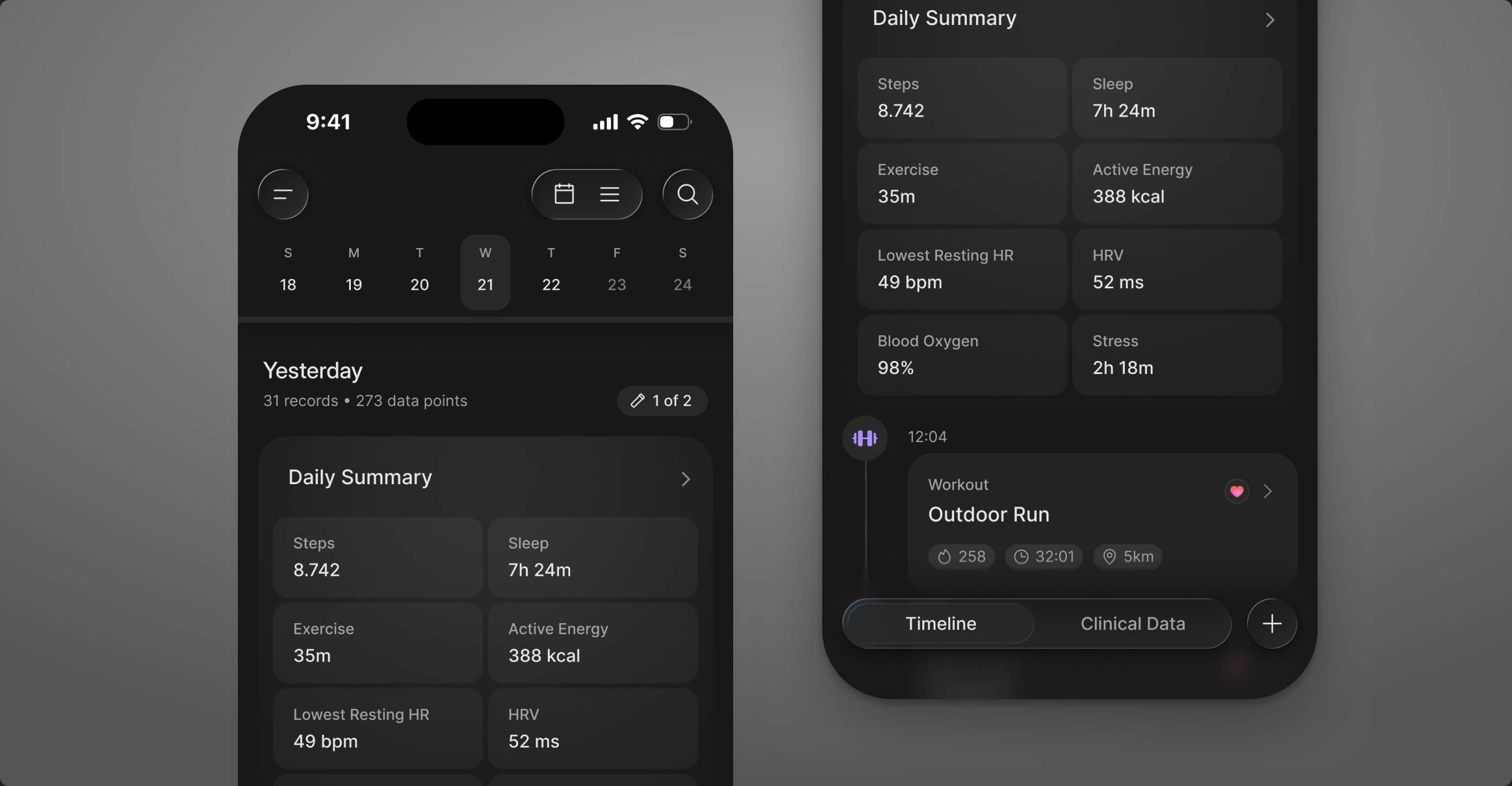
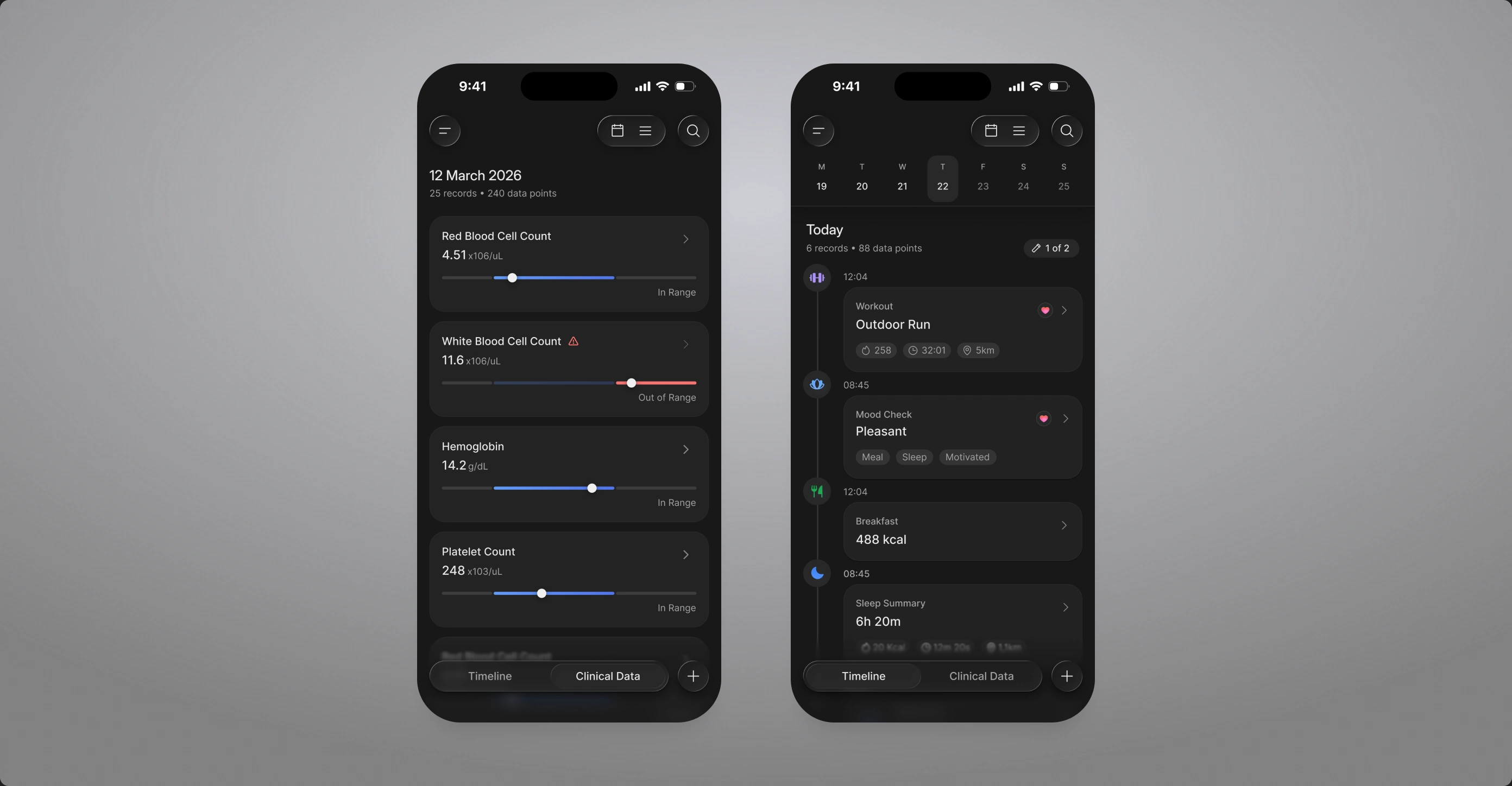
We expanded a concept we already had. The Health Timeline gives a quick overview of what happened, when and where, and every day closes with a generated daily summary pinned to the top.
Clinical Data and the Timeline side by side, because blood tests change what a person should do next. Seeing both in the app tells users the data is really there.
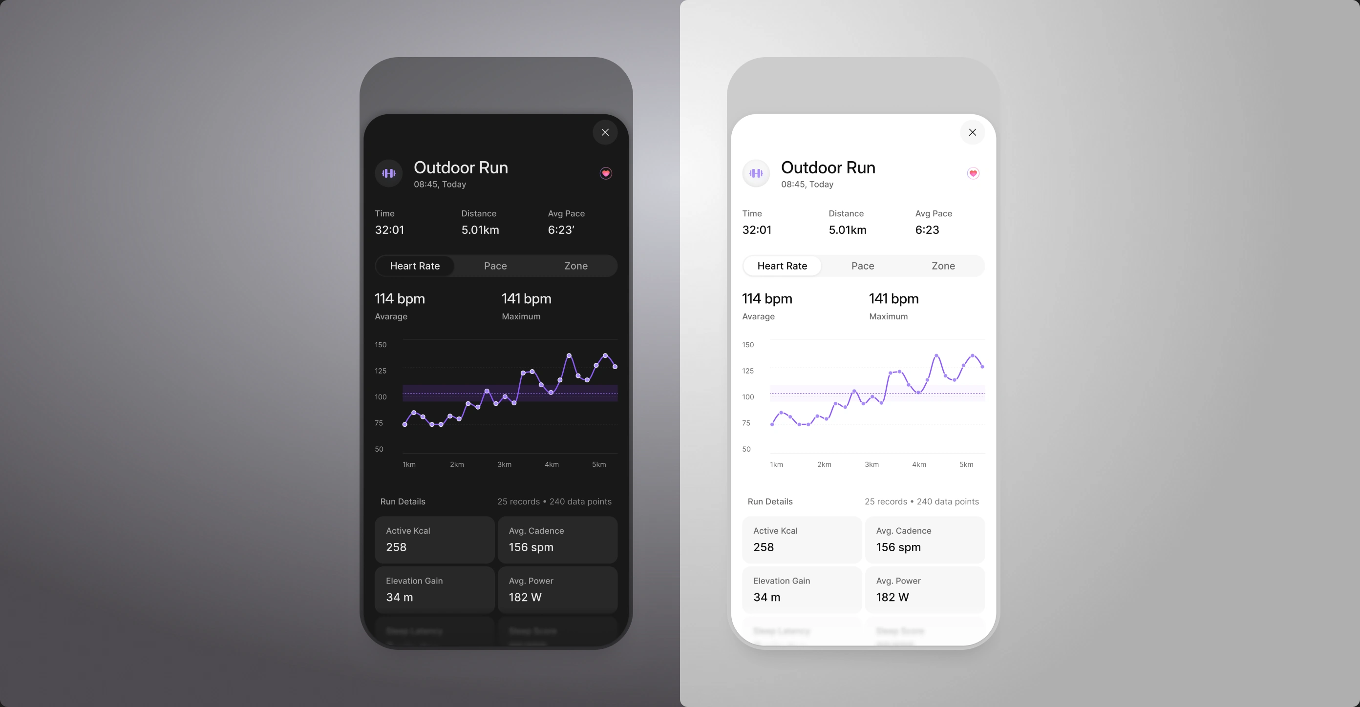
Every entry opens into its own detail, in dark or light. The [+] on an entry was meant to start a conversation from that exact point.
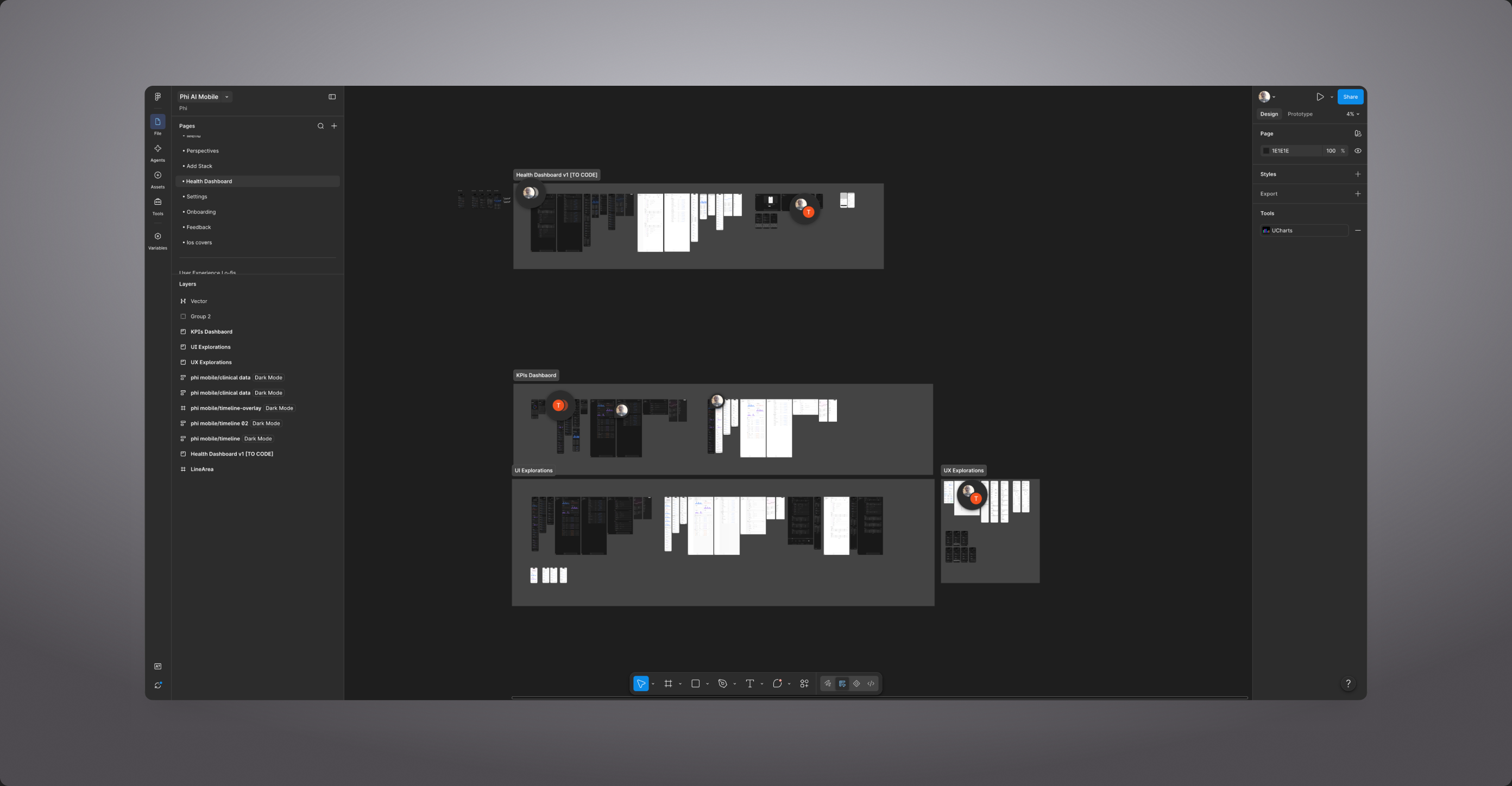
The UX stayed deliberately plain: the same screens had to be copied to the web app without extra work.
Long health conversations quietly eat energy. We let users compact them instead of starting over.
Some users came back to the same thread for weeks: a knee, sleep, a new supplement. Every message carried the whole history, so answers got slower and cost more. We heard about it from them directly and shipped a quick fix together.
long thread → summary → the same chat, lighter
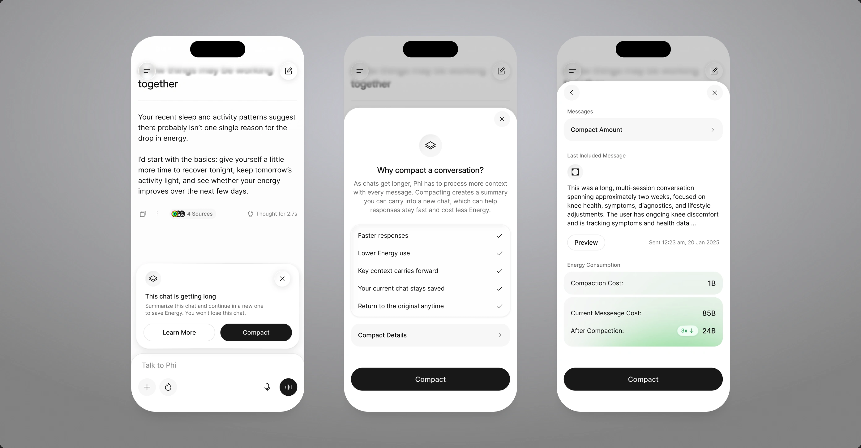
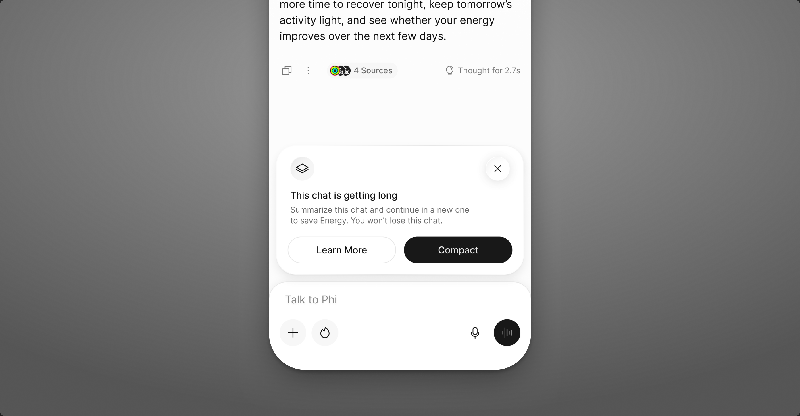
When a thread gets long, Phi offers to compact it: a summary of what matters, a new lighter chat, and the old one kept intact. A short explainer shows what is kept and how much energy it saves.
The prompt lives inside the composer, where the problem shows up. One line, two choices, nothing to configure.
Takeaway
Phi shipped as an MVP, and that was the point. We decided what not to build before anyone opened Figma, so every screen after was cheaper to make and easier to defend. Perspectives, Stack, the Health Timeline and Compact are the same decision in four places: a health app gets one chance to be wrong, so show what it knows and where it got it.
What is live is the smallest version that earns trust. The next round is about depth, not more features: more sources behind each answer, richer timelines and a Stack that learns from the log. If I did it again, I would put the Perspectives moment in front of users in the first week, not the fourth.
More screens from Phi2025–2026